1
Additive and subtractive colour:
An additive colour involves light emitted directly from a source. Additive colours are made from Red Green and Blue; RGB. Combining all three primary colours produces white and just adding two primary colours in equal amounts produces the secondary colour, as the diagram illustrates. As a designer the colours used from the RGB gamut, (the colour space) is for design based on screen.
Subtractive colour is like mixing paint, inks or dyes; each primary mixed with another creates the secondary colours shown on the diagram. Where as adding colours in the additive creates white, subtractive starts with white and eventually when overlapped will create black. This model is used when designers are creating work for print, they focus on the CMYK gamut, which uses the primary colours Cyan, Magenta, Yellow and Key Black. This offers a wide range of colours, but when compared to the RGB gamut differences can be seen because luminous colours can be possible in RGB. 
Gamut = a range of colours.
- Wide gamut – photography
- Adobe RGB – special monitor
- Spot colour – mix ink separately to achieve a specific colour.
- SRGB – standard monitors
- CMYK – 4-colour process printing
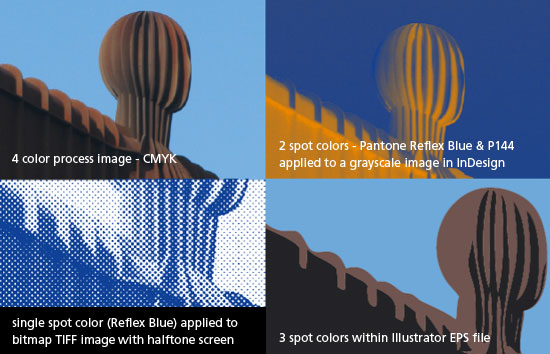
CMYK:
Cyan, magenta and key black. These are the four colours of ink that printers mix to make every colour in that spectrum. CMYK have a separate, adjustable plate for each of these inks, which makes it possible to precisely control them through channels. When it comes to printing the most common method of CMYK printing is offset litho.
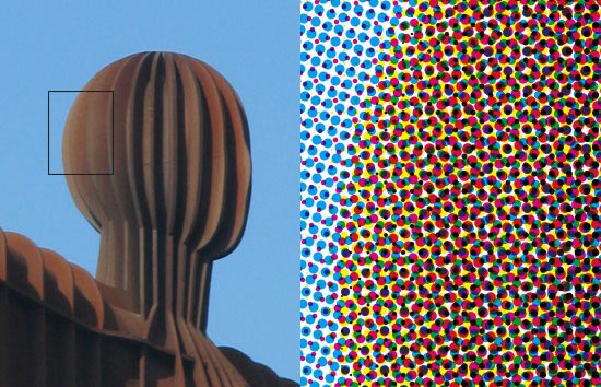
Spot colour: printing is where a colour is created and printed in 1 run. This colour can be straight out of the tin or a mixture of two or more colours. A document may be printed in any amount of spot colours and may also be printed in four colour process then extra colours added by spot colour printing.
These additional spot colour colours can include metallic ink, fluorescent ink and gloss or mat varnish.
The four colour printing process is technically unable to accurately reproduce spot colours. This variation may not be noticeable or may vary greatly, depending on the colour to be matched.
A spot colour is simply an exact colour of ink, mixed to your precise requirements. Firms with a recognisable colour brand (EasyJet orange; DynoRod fluorescent red) would always specify spot colours to ensure consistency of their brand colour.
spot colour - pantone example:
Easyjet pantone reference 021C


Grayscale:
Print produced from a range of gray tones. Used widely as a cheaper process than colour printing. Tonal variations can be achieved by using different channels for example the Red channel in RGB will produce a different grayscale image to the Green channel.


Duotone:
Two colours used to create the piece of print work using a range of tones from the two colours, tritones and quadtones can also be acheived. Adjusting the tonal values of each colour can be achieved by altering the graph under the duotone option in photoshop. Duotones can be produced by using any two colours so spot colours could be used, so using just to colours through a piece of print design can be more cost effective than full colour process. Making use of duotones is an effective way of cutting cost with still having enough scope to create interesting designs.

Monotone:
Creating a piece of print that uses only one colour, different tints of a colour can be used and using different coloured stocks can act as a second colour when considered well in a design